Brand and Deliver
When Optimize Health was founded in 2015, the world was a little different. The iPod was still a flagship Apple device, the sci-fi world welcomed Episode VIII to the Star Wars canon, and telehealth was just cutting its teeth on possibility.
Fast forward to 2022 and a lot has changed. The iPod is no longer (RIP), James Earl Jones officially retired as the voice of Darth Vader, and we are still emerging from the throes of a global pandemic that completely transformed how people think about—and access—healthcare.
Similarly, within those seven years, Optimize Health also changed. We went from an emerging RPM company to the premier solution that delivers the leading platform and managed services, and we needed our voice in the market to reflect this growth.
In the Beginning
When I joined Optimize Health in late 2020, it seemed that there was a new company entering the RPM space each week. As I learned more about the space and visited other companies’ websites, I noticed something.
Nearly all of these websites featured images of their RPM technology or software, but eschewed the human element altogether. Few, if any, people were present or featured, which remains true to this day.
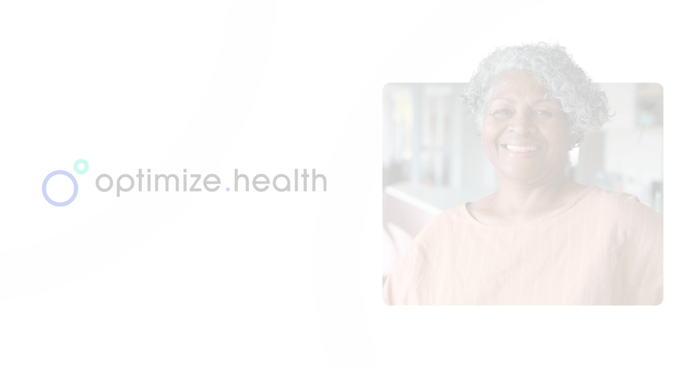
At Optimize Health, we believe that one of the most sacred relationships has been–and will always be–the relationship between patients and providers. That’s why from the very start, our brand’s visual identity has focused on the providers and care teams delivering care and the patients receiving care, rather than just our technology itself.
In late 2020, we partnered with leading design agency Atomic Health to leverage their healthcare expertise to help us rethink–and re-contextualize–our brand in the space. Conducting interviews with internal and external stakeholders, Atomic helped us discover that what patients and providers love most about our solution is the way it’s helped providers forge deeper bonds with patients and improve their health outcomes. In other words, the most compelling part of our offering is how we enable people to stay connected outside the four walls of the office visit.
With these insights in mind, we re-centered our visual identity around the patient-provider relationship, and how RPM is revolutionizing the quality and quantity of interactions outside regular office visits. We also updated our iconography to be more simple, using thinner lines and fewer tertiary elements and colors.
Over the next 12 months, two things happened: the virtual care landscape became an estimated $250B industry globally, and in response, a number of vendors doubled down on profit opportunities and revenue management tools.
And still, despite the revenue opportunities, when we talked to our clients and their patients, and surveyed providers across market segments, the top reason medical providers were interested in remote care programs like RPM was because it made it easier for them to understand how their patients are doing outside of office visits. (Our own market research showed that revenue opportunities ranked behind understanding the staff and resources needed to build and sustain a successful RPM program. If you’re interested, we’ve got a resource for that).
As 2021 came to a close and we exceeded our revenue and patient count targets, we revisited our brand by asking our internal and external audiences if our brand was where our heart is: Are we reflecting our values of improving patient and provider bonds and improving patient lives?
Brand to the Future
Since connecting is about people, when we evaluated our brand through this lens, we decided that less is visual intent is key, and less is more.
We removed the secondary and even tertiary background patterns to reduce the visual white noise to refocus on what makes high-quality, healthcare connections possible: people helping other people. That’s why you will our brand images focused on people with less visual background elements.
Perhaps most importantly, we also use images that represent real patients in their homes to help tell the story and portray the ease and experience of remote care, as well as images of providers and care teams in their clinical settings (white coats not needed).
Combined, our visual message is simple, clean, and purposeful.
And as we continue to evolve, our brand will too. But we will always be a champion of using the minutes outside of office visits to strengthen the patient-provider relationship and help them stay connected. After all, healthcare technology is just zeros and ones if it isn’t actively solving for how to bring people closer together.
Learn more about how RPM and remote care can power better health outcomes for anyone, anywhere.
